Between 1960 and 1964, Roger Corman adapted eight works by Edgar Allen Poe. In my mind, it is really seven since The Haunted Palace is actually inspired by an H.P. Lovecraft short story, The Case of Charles Dexter Ward, and the title for the adaptation was changed to that of a Poe poem. The film was made during this era, however, so it often gets included. Corman’s partnership with Vincent Price during this era is a thing of beauty though he did not star in The Premature Burial. Ray Milland took the lead role in that film.
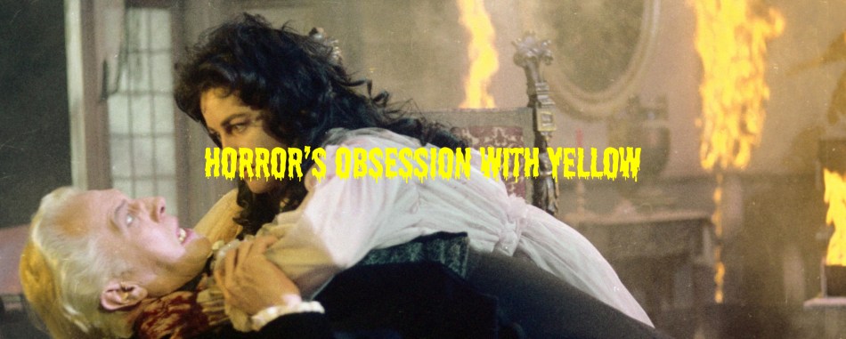
I’m going to discuss three of these films today and how Corman used yellow in his marketing posters throughout his career.
House of Usher
In House of Usher, interiors of the house featured yellow wallpapers and gold tinted curtains. The exterior of the dilapidated house is brown and yellow, the color of rot. This was meant to show the awful family curse that had supposedly befallen the Usher family, and also the illness within the home as it is suspected that Roderick Usher buried his wife prematurely. Some of the furniture is gold which is a stark contrast to the exterior of the home, further showing how the greed of Roderick Usher can’t save the home or the family from what is coming. Even the chapel room within the home has walls tinted dark yellow, the color of puss. Of infection and illness. The candlelight used throughout the film adds to this effect. The grief of Madeline’s death is heavy in that scene in the chapel largely because of how they lit and decorated it.
The red and black costumes of Roderick Usher’s character in this film, played by Price, are in stark contrast to Winthrop who wears a vibrant blue suit. This shows the dark nature of Usher’s character. Even his hair is the color of puss, a sickly yellowish grey. Price’s performance is absolutely wonderful. Ominous. Apathetic. One of my favorite Poe adaptations with good reason. Visually, the symbolism goes as deep as the story itself and the cast is perfect.
The Pit and the Pendulum
The Pit and the Pendulum was the second Poe adaptation Price and Corman created together. What I noticed upon rewatch this year was even the cliffs the home sat on were yellowish in color as if the very ground they home sat on had been poisoned by the owner of the home. Vincent Price plays a cruel Spanish Inquisitor who has married the sister of Francis Barnard. When Barnard arrives seeking answers about his sister’s mysterious death, the Inquisitor has him tied up under threat of torture. The film also stars Scream Queen Barbara Steele. The performances of Steele and Price when the two finally share screen time is so very good.
During the sequence when the Inquisitor is hammering his way through a brick wall, the wall itself is a putrid yellowish-brown color, much like the cliffs outside. Inside the room behind the brick wall, a hideously decayed corpse. It was a blatant attempt to terrify the audience and it worked. One of my favorite sequences from any Corman film.
The Masque of the Red Death
The Masque of the Red Death is so beautifully decorated in yellow that it takes on many meanings. Prospero’s castle is decorated lavishly with gold curtains, upholstery, and wall hangings showing his greed and selfishness as his people die of illness all over the countryside. His royal court is often hanging around in brightly colored clothing, much of it adorned with gold stitching and pretty bobbles. These people are too greedy to help the less fortunate and choose to hide away in the castle whilst people die. The moral decay of the rich is on full display as they make a mockery of the situation.
In Poe’s story, Prospero has a series of rooms, each a different color and has a different meaning. In his story, there is no yellow room. Orange, yes, but no yellow. The film does have a yellow room that, according to Prospero, so brilliantly mimicked the shining of the sun that a prisoner trapped there for three years could not look upon the sun or a daffodil again after their release. Prospero was proud that this room had been used by his father as a form of control over another man, much to Francesca’s dismay. In a story about illness, this shows how completely flawed and lacking in empathy Prospero truly is, which is made worse when Francesca discovers that he worships Satan.
His ballroom has gold candelabras and gold marble in the pattern on the floor. Gold curtains soften the room. This exquisite décor should have been a warning to the people hiding within this castle. There is no morality. No empathy. Just a selfish Prince and rich people too afraid of the red death to help those who need it. He throws them diamonds and jewels, and they dive to the floor for it. There is no saving these people from themselves.
In Poe’s original story, a masked figure appears during the final ball. When he is unmasked, he cannot take any tangible form. It is the red death itself, faceless and vile, and everyone dies instantly for their sins. In this adaptation, Prospero sees his own image when he unmasks this disguised figure. He sees that he is to blame for his greed and his apathy. He has created his own hell and there is no escape. I love both endings, but Prospero seeing his own undoing staring back at him is a thing of beauty. Terrifying, horrific beauty.
After all, why should he be afraid to die? His soul had been dead for a long time.
Poster Art and Corman’s Influence
Roger Corman had a prolific career directing and producing horror movies outside of the Poe era. He was known for his creature features including Attack of the Crab Monsters, The Giant Leeches, It Conquered the World, The Wasp Woman, and Piranha which starred Barbara Steele.
He was known as more of a B-Movie director, but if it weren’t for Corman, we wouldn’t have the films we have today. He was able to work with slashed budgets and minimal resources but that didn’t stop him from finding a work-around. Today, horror films with considerably small budgets often pull in large profits for studios whilst giving audiences good scares at the theater.
Corman not only used yellow in his films, but also the poster art. The poster art for his films almost always included yellow while also utilizing the b-movie feel to his films.
The Little Shop of Horrors was a black comedy destined to become one of the best cult classics of horror movie history. They reused sets from A Bucket of Blood which were about to be destroyed. It was shot in just a couple of weekends.
One of my favorite Corman produced creature features is Piranha directed by Joe Dante. Not only did it spawn a sequel, but a fairly hilarious modern remake starring Elizabeth Shue and a sequel to that. These sequels pay homage to the B movie feel that Corman made a career of. The poster art for the original remains one of the most memorable and is still used today for DVD and Blu Ray sales. The yellow floatation device is thought to have been copied from Jaws which tracks since Piranha took advantage of the Spielberg film’s popularity with its premise.
If you’re a fan of Joe Bob Briggs and The Last Drive-In on Shudder, the series recently featured the original Piranha which shows the staying power of Corman’s films from throughout his career. They still get talked about throughout the industry.
Corman and Many Inspired Icons
Corman also gave several Hollywood icons their start in his films. Jack Nicholson got his start in films like this, but it was The Cry-Baby Killer that was his first Corman film. Any horror fan knows that Nicholson would go on to play Jack Torrence in The Shining, one of the most iconic performances in horror film history. Later, he would do creature feature Wolf.
Wes Craven’s The Hills Have Eyes (1977) is thought to pay homage to Corman’s film The St. Valentine’s Day Massacre. Craven would go on to have two franchises that broke the mold and pushed the horror genre forward. A Nightmare on Elm Street and Scream took the slasher genre to new heights. Scream changed the game so much that it’s hardly been matched since as far as slashers go and we are still getting sequels after Craven’s death.
Francis Ford Coppola worked with Corman multiple times early in his career. They are both credited on directing The Terror in 1963, the same year that Coppola’s Dementia 13 was released. Coppola would go on to direct The Godfather and Bram Stoker’s Dracula.
Roger Corman mentored Martin Scorsese when the latter was directing his second film, Boxcar Bertha in 1972. Scorsese would go on to have a prolific career in film, including several that made the rounds during various Awards Seasons. He worked with both Robert DeNiro and Leonardo DiCaprio multiple times with great success. His closest foray into horror, though, are thrillers Cape Fear and the vastly underrated Shutter Island.
James Cameron started out as a VFX worker in some of Corman’s B-Movies. He would later go on to direct the first two Terminator movies, The Abyss, and Aliens. You can see the effect working with Corman had on James Cameron in Aliens, a film that employs creature effects to get its scares. This love for the special effects side of filmmaking would lead him to sinking the Titanic and spending twenty years developing technology for the Avatar films.
The lasting effects of Roger Corman’s film career are all around us, as is the color yellow. I will dig deeper into the use of yellow in horror poster art in another installment of this series.
Discover more from Becky Tyler Art and Photography
Subscribe to get the latest posts sent to your email.

Chapter 7
Between 1960 and 1964, Roger Corman adapted eight works by Edgar Allen Poe. In my mind, it is really seven since The Haunted Palace is actually inspired by an H.P. Lovecraft short story, The Case of Charles Dexter Ward, and the title for the adaptation was changed to that of a Poe poem. The film was made during this era, however, so it often gets included. Corman’s partnership with Vincent Price during this era is a thing of beauty though he did not star in The Premature Burial. Ray Milland took the lead role in that film.
I’m going to discuss three of these films today and how Corman used yellow in his marketing posters throughout his career.
House of Usher
In House of Usher, interiors of the house featured yellow wallpapers and gold tinted curtains. The exterior of the dilapidated house is brown and yellow, the color of rot. This was meant to show the awful family curse that had supposedly befallen the Usher family, and also the illness within the home as it is suspected that Roderick Usher buried his wife prematurely. Some of the furniture is gold which is a stark contrast to the exterior of the home, further showing how the greed of Roderick Usher can’t save the home or the family from what is coming. Even the chapel room within the home has walls tinted dark yellow, the color of puss. Of infection and illness. The candlelight used throughout the film adds to this effect. The grief of Madeline’s death is heavy in that scene in the chapel largely because of how they lit and decorated it.
The red and black costumes of Roderick Usher’s character in this film, played by Price, are in stark contrast to Winthrop who wears a vibrant blue suit. This shows the dark nature of Usher’s character. Even his hair is the color of puss, a sickly yellowish grey. Price’s performance is absolutely wonderful. Ominous. Apathetic. One of my favorite Poe adaptations with good reason. Visually, the symbolism goes as deep as the story itself and the cast is perfect.
The Pit and the Pendulum
The Pit and the Pendulum was the second Poe adaptation Price and Corman created together. What I noticed upon rewatch this year was even the cliffs the home sat on were yellowish in color as if the very ground they home sat on had been poisoned by the owner of the home. Vincent Price plays a cruel Spanish Inquisitor who has married the sister of Francis Barnard. When Barnard arrives seeking answers about his sister’s mysterious death, the Inquisitor has him tied up under threat of torture. The film also stars Scream Queen Barbara Steele. The performances of Steele and Price when the two finally share screen time is so very good.
During the sequence when the Inquisitor is hammering his way through a brick wall, the wall itself is a putrid yellowish-brown color, much like the cliffs outside. Inside the room behind the brick wall, a hideously decayed corpse. It was a blatant attempt to terrify the audience and it worked. One of my favorite sequences from any Corman film.
The Masque of the Red Death
The Masque of the Red Death is so beautifully decorated in yellow that it takes on many meanings. Prospero’s castle is decorated lavishly with gold curtains, upholstery, and wall hangings showing his greed and selfishness as his people die of illness all over the countryside. His royal court is often hanging around in brightly colored clothing, much of it adorned with gold stitching and pretty bobbles. These people are too greedy to help the less fortunate and choose to hide away in the castle whilst people die. The moral decay of the rich is on full display as they make a mockery of the situation.
In Poe’s story, Prospero has a series of rooms, each a different color and has a different meaning. In his story, there is no yellow room. Orange, yes, but no yellow. The film does have a yellow room that, according to Prospero, so brilliantly mimicked the shining of the sun that a prisoner trapped there for three years could not look upon the sun or a daffodil again after their release. Prospero was proud that this room had been used by his father as a form of control over another man, much to Francesca’s dismay. In a story about illness, this shows how completely flawed and lacking in empathy Prospero truly is, which is made worse when Francesca discovers that he worships Satan.
His ballroom has gold candelabras and gold marble in the pattern on the floor. Gold curtains soften the room. This exquisite décor should have been a warning to the people hiding within this castle. There is no morality. No empathy. Just a selfish Prince and rich people too afraid of the red death to help those who need it. He throws them diamonds and jewels, and they dive to the floor for it. There is no saving these people from themselves.
In Poe’s original story, a masked figure appears during the final ball. When he is unmasked, he cannot take any tangible form. It is the red death itself, faceless and vile, and everyone dies instantly for their sins. In this adaptation, Prospero sees his own image when he unmasks this disguised figure. He sees that he is to blame for his greed and his apathy. He has created his own hell and there is no escape. I love both endings, but Prospero seeing his own undoing staring back at him is a thing of beauty. Terrifying, horrific beauty.
After all, why should he be afraid to die? His soul had been dead for a long time.
Poster Art and Corman’s Influence
Roger Corman had a prolific career directing and producing horror movies outside of the Poe era. He was known for his creature features including Attack of the Crab Monsters, The Giant Leeches, It Conquered the World, The Wasp Woman, and Piranha which starred Barbara Steele.
He was known as more of a B-Movie director, but if it weren’t for Corman, we wouldn’t have the films we have today. He was able to work with slashed budgets and minimal resources but that didn’t stop him from finding a work-around. Today, horror films with considerably small budgets often pull in large profits for studios whilst giving audiences good scares at the theater.
Corman not only used yellow in his films, but also the poster art. The poster art for his films almost always included yellow while also utilizing the b-movie feel to his films.
The Little Shop of Horrors was a black comedy destined to become one of the best cult classics of horror movie history. They reused sets from A Bucket of Blood which were about to be destroyed. It was shot in just a couple of weekends.
One of my favorite Corman produced creature features is Piranha directed by Joe Dante. Not only did it spawn a sequel, but a fairly hilarious modern remake starring Elizabeth Shue and a sequel to that. These sequels pay homage to the B movie feel that Corman made a career of. The poster art for the original remains one of the most memorable and is still used today for DVD and Blu Ray sales. The yellow floatation device is thought to have been copied from Jaws which tracks since Piranha took advantage of the Spielberg film’s popularity with its premise.
If you’re a fan of Joe Bob Briggs and The Last Drive-In on Shudder, the series recently featured the original Piranha which shows the staying power of Corman’s films from throughout his career. They still get talked about throughout the industry.
Corman and Many Inspired Icons
Corman also gave several Hollywood icons their start in his films. Jack Nicholson got his start in films like this, but it was The Cry-Baby Killer that was his first Corman film. Any horror fan knows that Nicholson would go on to play Jack Torrence in The Shining, one of the most iconic performances in horror film history. Later, he would do creature feature Wolf.
Wes Craven’s The Hills Have Eyes (1977) is thought to pay homage to Corman’s film The St. Valentine’s Day Massacre. Craven would go on to have two franchises that broke the mold and pushed the horror genre forward. A Nightmare on Elm Street and Scream took the slasher genre to new heights. Scream changed the game so much that it’s hardly been matched since as far as slashers go and we are still getting sequels after Craven’s death.
Francis Ford Coppola worked with Corman multiple times early in his career. They are both credited on directing The Terror in 1963, the same year that Coppola’s Dementia 13 was released. Coppola would go on to direct The Godfather and Bram Stoker’s Dracula.
Roger Corman mentored Martin Scorsese when the latter was directing his second film, Boxcar Bertha in 1972. Scorsese would go on to have a prolific career in film, including several that made the rounds during various Awards Seasons. He worked with both Robert DeNiro and Leonardo DiCaprio multiple times with great success. His closest foray into horror, though, are thrillers Cape Fear and the vastly underrated Shutter Island.
James Cameron started out as a VFX worker in some of Corman’s B-Movies. He would later go on to direct the first two Terminator movies, The Abyss, and Aliens. You can see the effect working with Corman had on James Cameron in Aliens, a film that employs creature effects to get its scares. This love for the special effects side of filmmaking would lead him to sinking the Titanic and spending twenty years developing technology for the Avatar films.
The lasting effects of Roger Corman’s film career are all around us, as is the color yellow. I will dig deeper into the use of yellow in horror poster art in another installment of this series.
Discover more from Becky Tyler Art and Photography
Subscribe to get the latest posts sent to your email.
Share this: